-
BK-XIII: Improved Constraints on Primordial Gravitational Waves Using Planck, WMAP, and BICEP/Keck Observations through the 2018 Observing Season
The BICEP/Keck Collaboration, Phys. Rev. Lett. 127, 151301, 2021
| Figures | Download Bundle | ||
|---|---|---|---|
| E and B-mode maps | 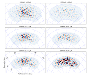 |
Figure 1: E-mode (left column) and B-mode (right column) maps at 95, 150 and 220 GHz in CMB units, and filtered to degree angular scales (\(50 \lt \ell \lt 120\)). Note the differing color ranges left and right. The E maps are dominated by ΛCDM signal, and hence are highly correlated across all three bands. The 95 GHz B map is approximately equal parts lensed-ΛCDM signal and noise. At 150 and 220 GHz the B maps are dominated by polarized dust emission. | PDF / PNG |
| EE and BB spectra | 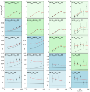 |
Figure 2: EE (green) and BB (blue) auto- and cross-spectra calculated using the BICEP3 95 GHz map, the BICEP2/Keck 150 GHz map, the Keck 220 GHz map, and the Planck 353 GHz map (with the auto-spectra in darker colors). The BICEP/Keck maps use all data taken up to and including the 2018 observing season—we refer to these as BK18. The black lines show the model expectation values for lensed-ΛCDM, while the red lines show the expectation values of a baseline lensed-ΛCDM+dust model from our previous BK15 analysis (\(r = 0\), \(A_{d,353} = 4.7\,\mu K^2\), \(\beta_d = 1.6\), \(\alpha_d = −0.4\)). Note that the model shown was fit to BB only and did not use the BICEP3 95 GHz points shown (which are entirely new). The agreement with the spectra involving 95 GHz and all the EE spectra (under the assumption that EE/BB = 2 for dust) is therefore a validation of the model. | PDF / PNG |
| Noise spectra and effective sky fraction | 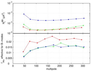 |
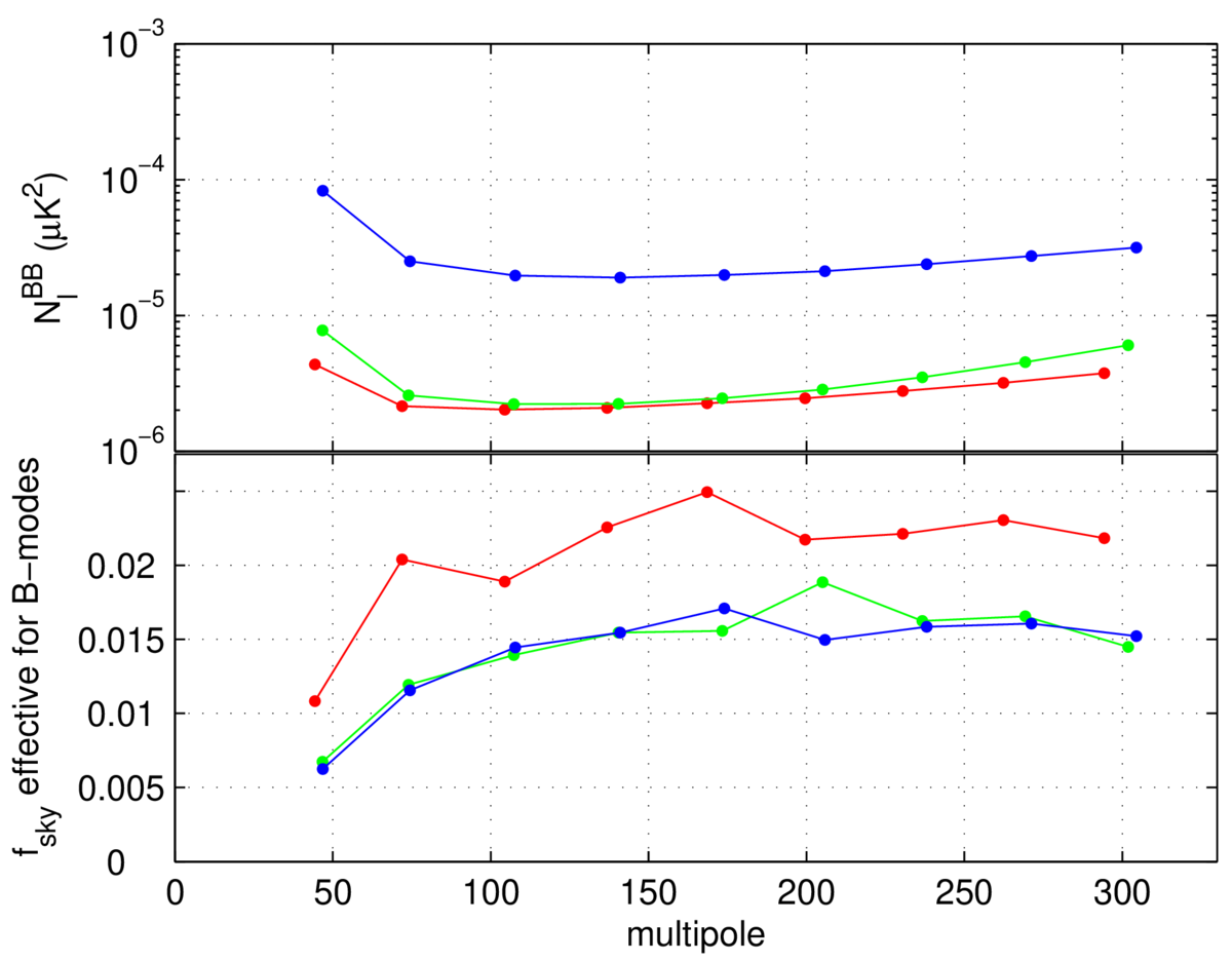
Figure 3: Upper: The noise spectra of the BICEP3 95 GHz map (red), the BICEP2/Keck 150 GHz map (green) and the Keck 220 GHz maps (blue). The spectra are shown after correction for the filtering of signal which occurs due to the beam roll-off, timestream filtering, and B-mode purification. (Note that no \(\ell^2\) scaling is applied.) Lower: The effective sky fraction as calculated from the ratio of the mean noise realization bandpowers to their fluctuation \(f_\mathrm{sky} (\ell) = \frac{1}{2 \ell \Delta \ell} \left( \frac{\sqrt{2} \bar{N}_b}{\sigma(N_b)} \right)^2\), i.e. the observed number of B-mode degrees of freedom divided by the nominal full-sky number. The turn-down at low \(\ell\) is due to mode loss to timestream filtering and matrix purification. |
PDF / PNG |
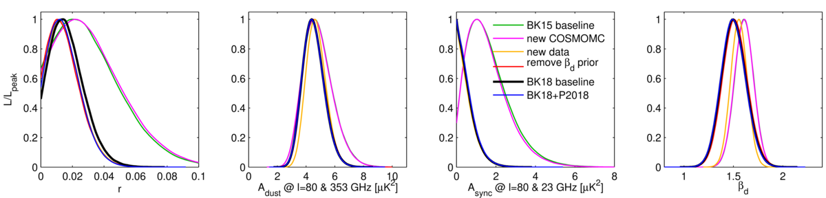
| Baseline likelihood analysis | 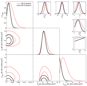 |
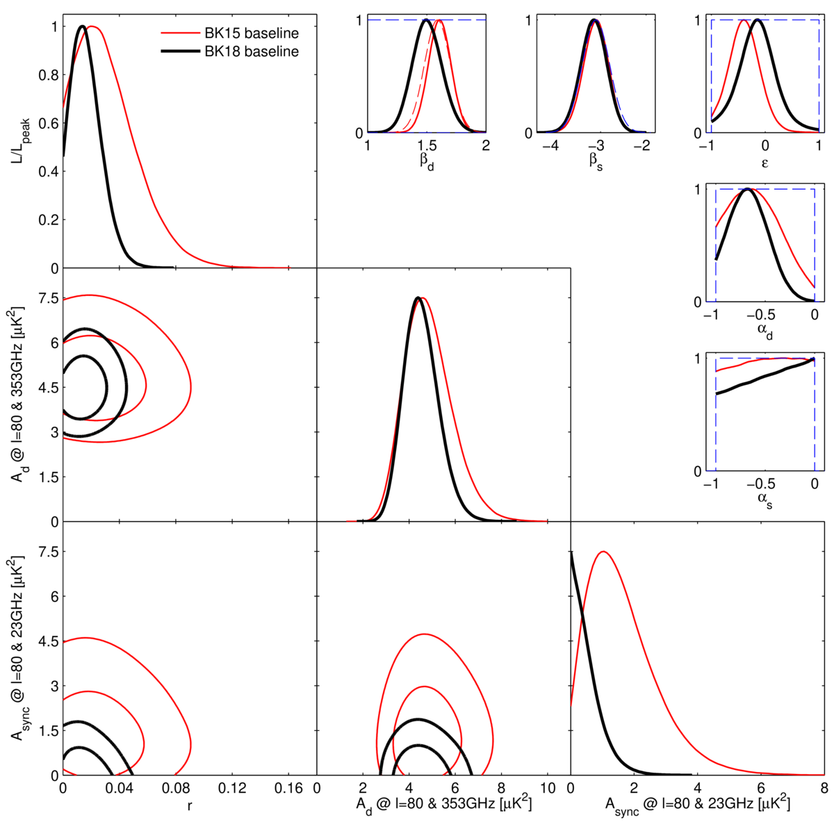
Figure 4: Results of a multicomponent multi-spectral likelihood analysis of BICEP/Keck+WMAP/Planck data. The red faint curves are the baseline result from the previous BK15 paper (the black curves from Fig. 4 of that paper). The bold black curves are the new baseline BK18 results, adding a large amount of additional data at 95 and 220 GHz taken by BICEP3 and Keck Array during the 2016–2018 observing seasons. The upper limit on the tensor-to-scalar ratio tightens to \(r_{0.05} \lt 0.036\) at 95% confidence. The parameters \(A_d\) and \(A_\mathrm{sync}\) are the amplitudes of the dust and synchrotron B-mode power spectra, where \(\beta\) and \(\alpha\) are the respective frequency and spatial spectral indices. The correlation coefficient between the dust and synchrotron patterns is \(\epsilon\). In the \(\beta\), \(\alpha\) and \(\epsilon\) panels the dashed lines show the priors placed on these parameters (either Gaussian or uniform). Note that the Gaussian prior on \(\beta_d\) has been removed going from BK15 to BK18. | PDF / PNG |
| r vs ns constraint |  |
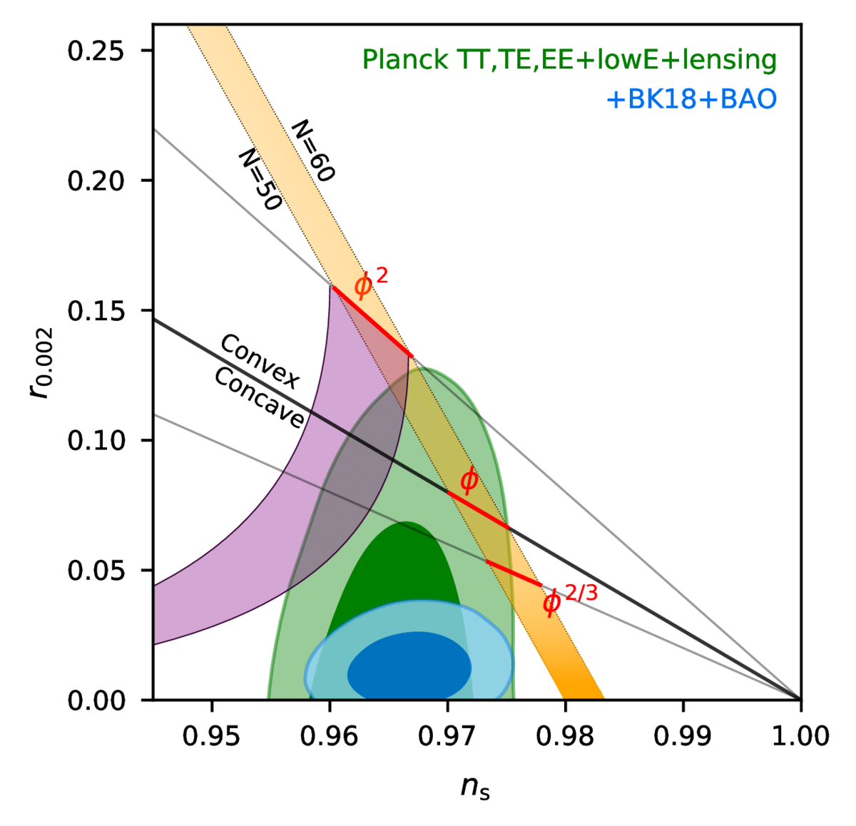
Figure 5: Constraints in the \(r\) vs. \(n_s\) plane for the Planck 2018 baseline analysis, and when also adding BICEP/Keck data through the end of the 2018 season plus BAO data to improve the constraint on \(n_s\). The constraint on \(r\) tightens from \(r_{0.05} \lt 0.11\) to \(r_{0.05} \lt 0.035\). This figure is adapted from Fig. 28 of Planck Collaboration 2018 VI with the green contours being identical. Some additional inflationary models are added from Fig. 8 of Planck Collaboration 2018 X with the purple region being natural inflation. | PDF / PNG |
| Noise vs. frequency | 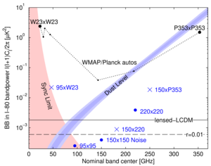 |
Figure 6: Expectation values and noise uncertainties of the \(\ell \sim 80\) BB bandpower in the BICEP/Keck field. The solid and dashed black lines show the expected signal power of lensed-ΛCDM and \(r_{0.05} = 0.01\). Since CMB units are used, the levels corresponding to these are flat with frequency. The blue bands show the \(1\) and \(2\sigma\) ranges of dust, and the red shaded region shows the 95% upper limit on synchrotron in the baseline analysis including the uncertainties in the amplitude and frequency spectral index parameters (\(A_\mathrm{sync,23}\), \(\beta_s\) and \(A_{d,353}\), \(\beta_d\)). The BICEP/Keck auto-spectrum noise uncertainties are shown as large blue circles, and the noise uncertainties of the used WMAP/Planck single-frequency spectra evaluated in the BICEP/Keck field are shown in black. The blue crosses show the noise uncertainty of selected cross-spectra, and are plotted at horizontal positions such that they can be compared vertically with the dust and sync curves. | PDF / PNG |
| Summary of B-mode upper limits | 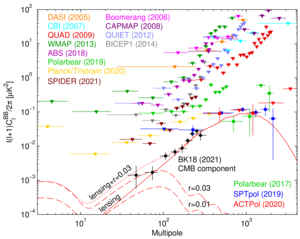 |
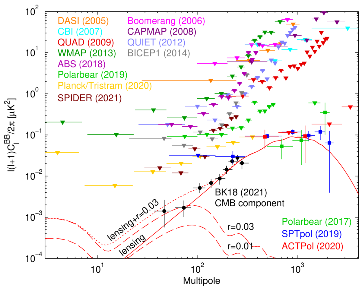
Figure 7: Summary of CMB B-mode polarization upper limits and detections. Theoretical predictions are shown for the lensing B-modes (solid red) which peak at arcminute scales (multipole \(\ell \sim 1000\)), and for gravitational wave B-modes (dashed red) for two values of \(r\) peaking at degree scales (\(\ell \sim 80\)). The BK18 data are shown after removing Galactic foregrounds. | PDF / PNG |
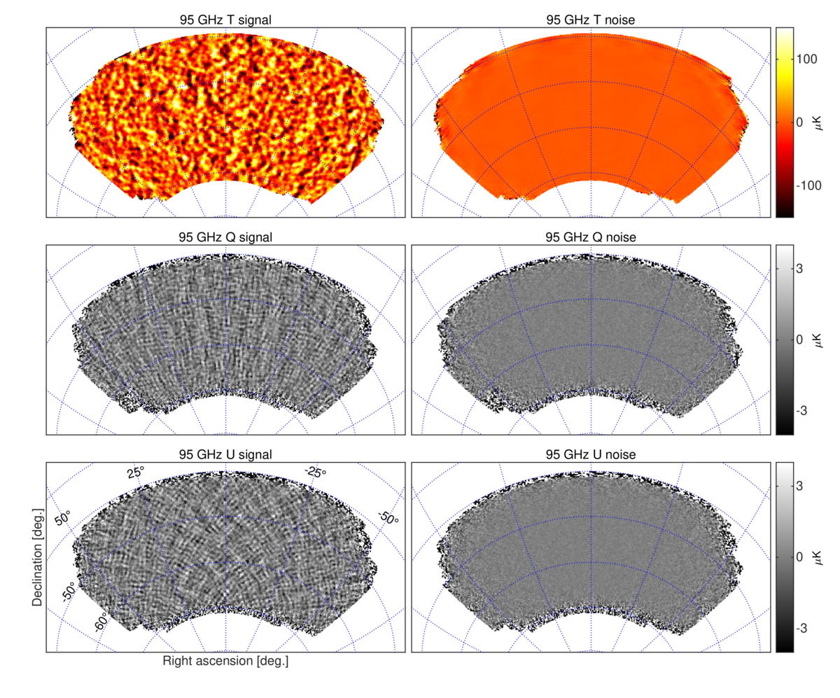
| 95 GHz maps | 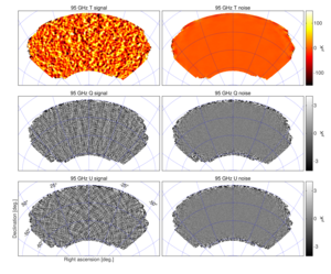 |
Figure 8: T, Q, U maps at 95 GHz using data taken by BICEP3 during the 2016–2018 seasons—we refer to these maps as BK18B95. The left column shows the real data maps with \(0.25^\circ\) pixelization as output by the reduction pipeline. The right column shows a noise realization made by randomly assigning positive and negative signs while coadding the data. These maps are filtered by the instrument beam (24 arcmin FWHM), timestream processing, and (for Q & U) deprojection of beam systematics. Note that the horizontal/vertical and \(45^\circ\) structures seen in the Q and U signal maps are expected for an E-mode dominated sky. | PDF / PNG |
| 150 GHz maps | 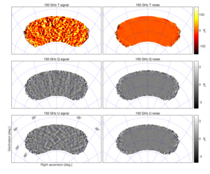 |
Figure 9: T, Q, U maps at 150 GHz using data taken by BICEP2 and Keck Array during the 2010–2016 seasons—we refer to these maps as BK18150. These maps are directly analogous to the 95 GHz maps shown in Fig. 8 except that the instrument beam filtering is in this case 30 arcmin FWHM. The smaller coverage region is due to the smaller instantaneous field of view of the BICEP2/Keck receivers. | PDF / PNG |
| 220 GHz maps | 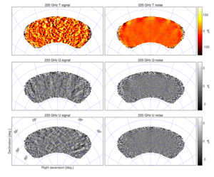 |
Figure 10: T, Q, U maps at \(\approx\) 220 GHz using 14 receiver-years of data taken by Keck Array during the 2015–2018 seasons—we refer to these maps as BK18220. These maps are directly analogous to the 95 GHz maps shown in Fig. 8 except that the instrument beam filtering is in this case 20 arcmin FWHM. Note the polarized dust emission which is visible in the right part of the Q/U signal maps. | PDF / PNG |
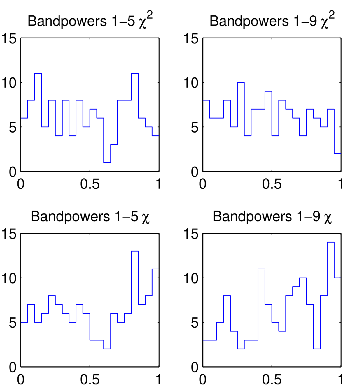
| 95 GHz jackknife histograms | 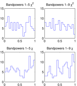 |
Figure 11: Distributions of the jackknife \(\chi^2\) and \(\chi\) PTE values for the BICEP3 2016, 2017, & 2018 95 GHz data. This figure is analogous to Fig. 10 of BK15. | PDF / PNG |
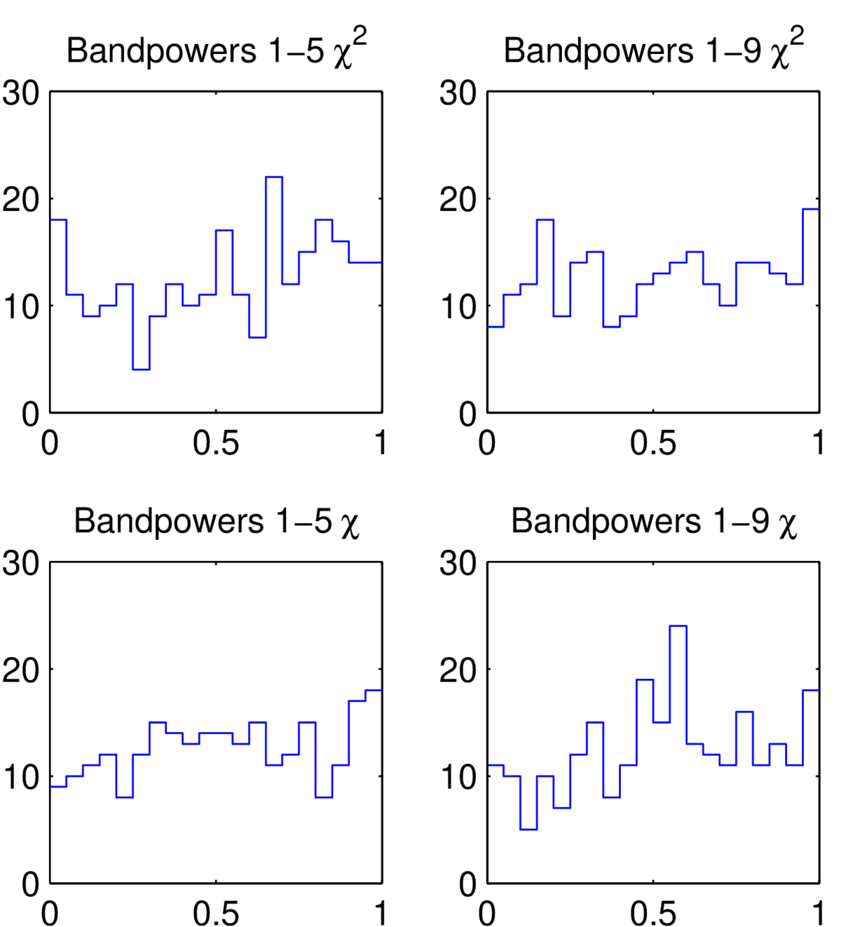
| 220 GHz jackknife histograms | 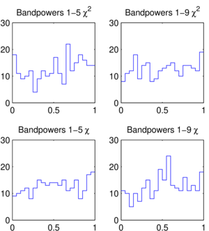 |
Figure 12: Distributions of the jackknife \(\chi^2\) and \(\chi\) PTE values for the Keck Array 2016, 2017, & 2018 220 GHz data. This figure is analogous to Fig. 11 of BK15. | PDF / PNG |
| Comparison of 95 GHz BB spectra | 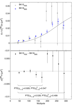 |
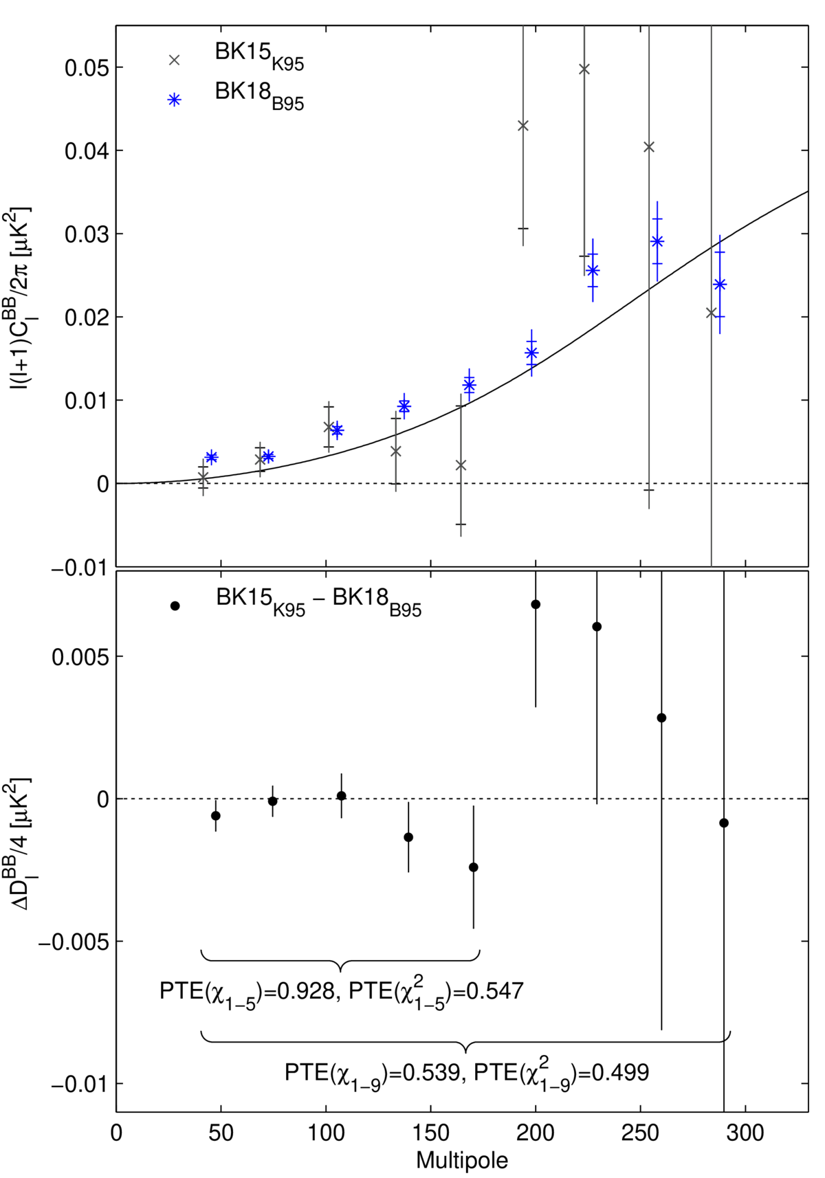
Figure 13: Upper: Comparison of the previously published 95 GHz BB auto-spectrum from the Keck Array receivers (BK15K95) to the new BICEP3 spectrum (BK18B95). The BICEP3 sky coverage region is a super-set of the Keck region. The inner error bars are the standard deviation of the noise realizations, while the outer error bars also include signal sample variance (lensed-ΛCDM+dust). Neither of these uncertainties are appropriate for comparison of the band power values—for this see the lower panel. The solid line shows the lensing B-mode expectation. (For clarity the sets of points are offset horizontally.) Lower: The difference of the spectra shown in the upper panel divided by a factor of four. The error bars are the standard deviation of the pairwise differences of signal+noise simulations which share common input skies (the simulations used to derive the outer error bars in the upper panel). Comparison of these points with null is an appropriate test of the compatibility of the spectra, and the PTE of \(\chi\) and \(\chi^2\) are shown. This figure is similar to Fig. 12 of BK15. | PDF / PNG |
| Comparison of 220 GHz BB spectra | 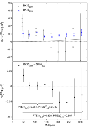 |
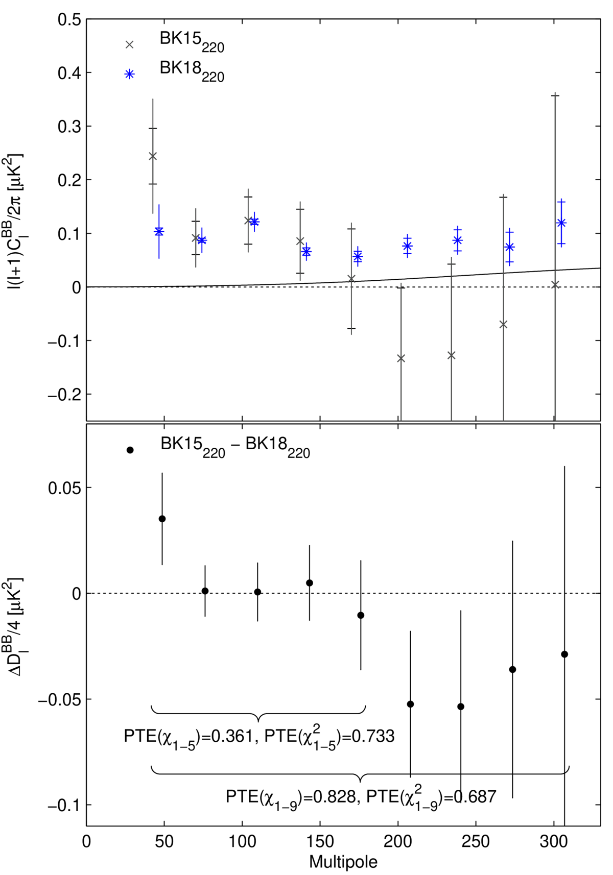
Figure 14: Comparison of the previously published 220 GHz BB auto-spectrum (BK15220) to the new BK18 version (BK18220). This figure is analogous to Fig. 13. In this case the sky coverage regions fully overlap but there is a small amount of common data between the two maps (2 receiver-years of the 14 receiver-years in BK18). | PDF / PNG |
| All BB auto- and cross-spectra | 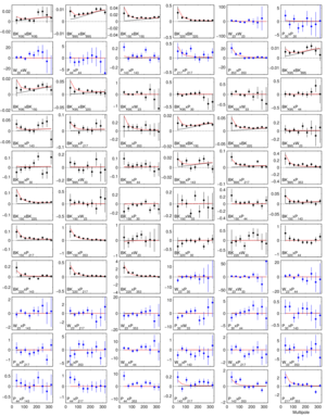 |
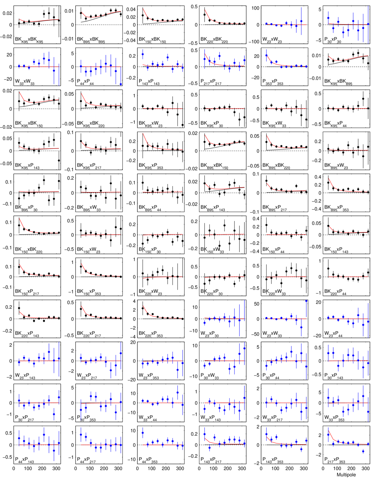
Figure 15: The full set of BB auto- and cross-spectra from which the joint model likelihood is derived. In all cases the quantity plotted is \(100 \ell C_\ell / 2 \pi \, (\mu K^2)\). Spectra involving BICEP/Keck data are shown as black points while those using only WMAP/Planck data are shown as blue points. The black lines show the expectation values for lensed-ΛCDM, while the red lines show the expectation values of the maximum likelihood lensed-ΛCDM+r+dust+synchrotron model (\(r = 0.011\), \(A_{d,353} = 4.4 \, \mu K^2\), \(\beta_d = 1.5\), \(\alpha_d = −0.66\), \(A_\mathrm{sync,23} = 0.6 \, \mu K^2\), \(\beta_s = −3.0\), \(\alpha_s = 0.00\), \(\epsilon = −0.11\)), and the error bars are scaled to that model. | PDF / PNG |
| BB spectral decomposition | 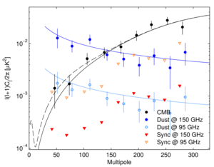 |
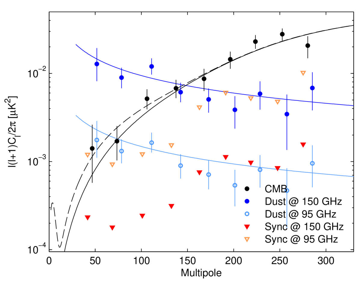
Figure 16: Spectral decomposition of the BB data into synchrotron (red), CMB (black) and dust (blue) components at 150 GHz (filled points) or 95 GHz (open points). The decomposition is calculated independently in each bandpower, marginalizing over \(\beta_d\), \(\beta_s\) and \(\epsilon\), with priors. Error bars denote 68% credible intervals, with the point marking the most probable value. For synchrotron, which is not detected in this analysis, the downward triangles denote 95% upper limits. (For clarity the sets of points are offset horizontally.) The solid black line shows lensed-ΛCDM with the dashed line adding on top an \(r_{0.05} = 0.011\) tensor contribution. The blue curves show the maximum-likelihood dust model from the baseline analysis (\(A_{d,353} = 4.4 \, \mu K^2\), \(\beta_d = 1.5\), and \(\alpha_d = −0.66\)) as evaluated at 150 GHz (dark blue) or 95 GHz (light blue). | PDF / PNG |
| Likelihood evolution | 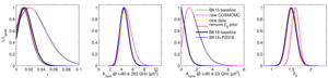 |
Figure 17: Evolution of the BK15 analysis to the new BK18 “baseline” analysis as defined in this paper. See Appendix E1 for further details. | PDF / PNG |
| Likelihood with dust decorrelation | 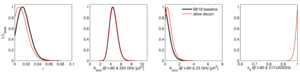 |
Figure 18: Likelihood results when freeing dust decorrelation parameter \(\Delta_d\). See Appendix E2 for details. | PDF / PNG |
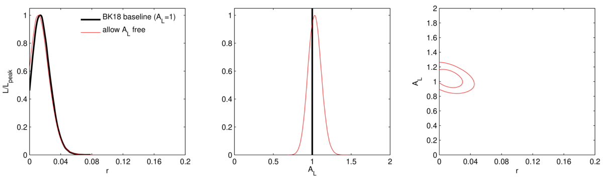
| Likelihood including lensing amplitude | 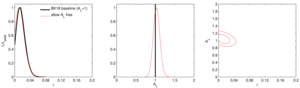 |
Figure 19: Likelihood results when allowing the lensing amplitude to be a free parameter. See Appendix E2 for details. | PDF / PNG |
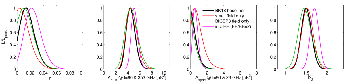
| Likelihood data set variations | 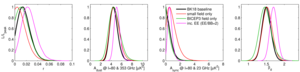 |
Figure 20: Likelihood results when varying the internal data set selection. The result including EE should not be overinterpreted. See Appendix E2 for details. | PDF / PNG |
| Likelihood without external maps | 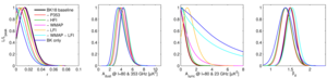 |
Figure 21: Likelihood results when removing some or all of the external WMAP and Planck bands. See Appendix E2 for details. | PDF / PNG |
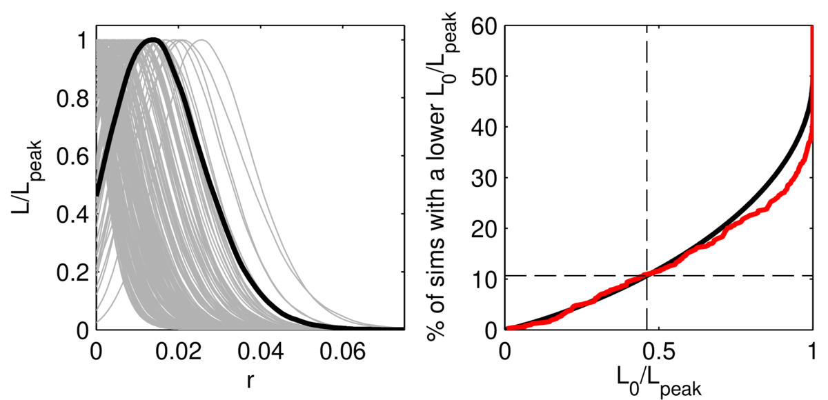
| Likelihood curves for simulations |  |
Figure 22: Left: Likelihood curves for \(r\) when running the baseline analysis on 200 of the lensed-ΛCDM+dust+noise simulations. The real data curve is shown overplotted in heavy black. Right: The CDF of the zero-to-peak ratio (red) of the curves shown at right as compared to the simple analytic ansatz (solid black) \(\frac{1}{2} (1 − f(−2 \log L_0 / L_\mathrm{peak}))\)) where \(f\) is the \(\chi^2\) CDF (for one degree of freedom). About one tenth of the simulations offer more evidence for non-zero \(r\) than the real data when the true value is actually zero (dashed black). |
PDF / PNG |
| Likelihood validation | 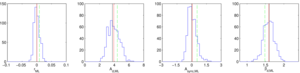 |
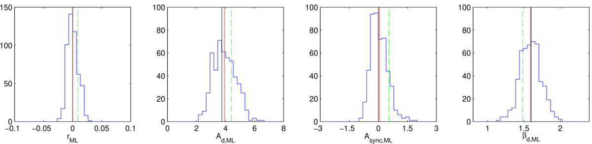
Figure 23: Results of a validation test running maximum likelihood search on the standard lensed-ΛCDM+dust+noise simulations (\(r = 0\), \(A_{d,353} = 3.75 \, \mu K^2\), \(\beta_d = 1.6\), \(\alpha_d = −0.4\), \(A_\mathrm{sync} = 0\)). The blue histograms are the recovered maximum likelihood values with the red lines marking their means and the black lines showing the input values. The green dashed lines are the real data values for the BK18 baseline data set. In the left panel \(\sigma(r) = 0.009\). See Appendix E3 for details. | PDF / PNG |
| \(T \rightarrow P\) leakage |  |
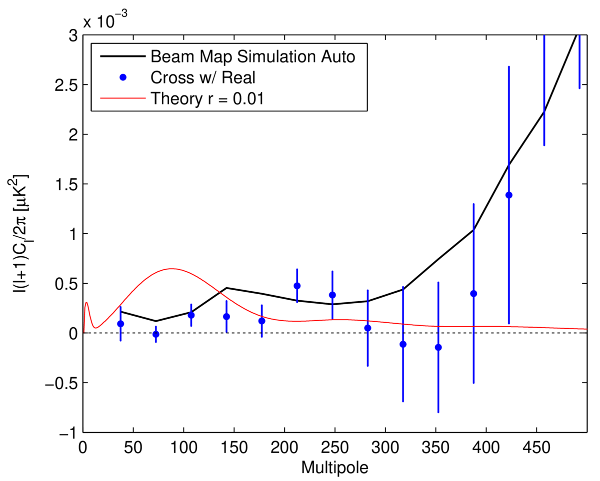
Figure 24: BB power spectra corresponding to \(T \rightarrow P\) leakage in BICEP3, as predicted by beam map simulations. The black line shows the auto-spectrum, which has been noise debiased (from noise in the beam map measurement). The blue circles show the cross of the beam map simulation with real BK18 data, with error bars derived from the cross between the fixed beam map simulation with 499 lensed-ΛCDM+dust+noise simulations. | PDF / PNG |
History
- 2021-10-04: Posted BK-XIII: Improved Constraints on Primoridal Gravitational Waves using Planck, WMAP, and BICEP/Keck Observations through the 2018 Observing Season figures.