-
BK-VI: Improved Constraints On Cosmology and Foregrounds When Adding 95 GHz Data From Keck Array
The Keck Array and BICEP2 Collaborations, Phys. Rev. Lett. 116, 031302, 2016
| Figures | Download Bundle | ||
|---|---|---|---|
| BK14 Q/U maps | 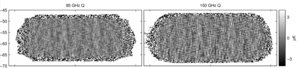 |
Figure 1: Deep Q maps at 95 & 150 GHz using all BICEP2/Keck data through the end of the 2014 observing season—we refer to these maps as BK14. Noise levels are 127 nK deg (left) and 50 nK deg (right). Both maps show a high signal-to-noise pattern dominated by E-mode polarization; the 95 GHz map appears smoother because of the larger beam size. | PDF / PNG |
| BK14 EE and BB spectra | 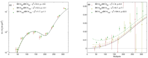 |
Figure 2: EE and BB auto- and cross-spectra between 95 & 150 GHz using all BICEP2/Keck data up to and including that taken during the 2014 observing season—we refer to these spectra as BK14. (For clarity the points are offset horizontally.) The solid black curves show the lensed-ΛCDM theory spectra. The error bars are the standard deviations of lensed-ΛCDM+noise simulations and hence contain no sample variance on any additional signal component. The χ2 and χ (sum of deviations) against lensed-ΛCDM for the lowest five bandpowers are given, and can be compared to their expectation value/standard deviation of 5/3.1 and 0/2.2 respectively. The dashed lines show a lensed-ΛCDM+dust model derived from our previous analysis. | PDF / PNG |
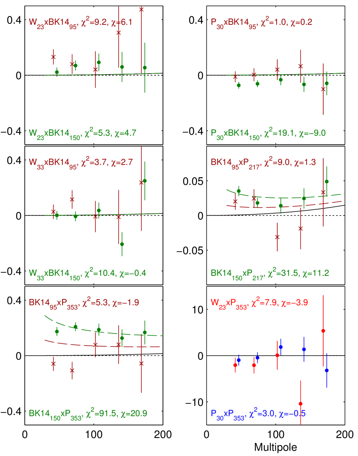
| Selected BB cross-spectra | 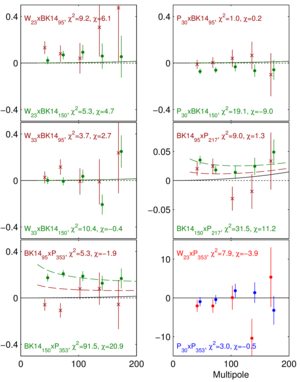 |
Figure 3: Selected BB cross-spectra between the BK14 maps at 95 (red) & 150 GHz (green) and the external maps of WMAP and Planck. The quantity plotted is ℓ(ℓ+1)Cℓ/2π (μK2), and the error bars are the standard deviations of the lensed-ΛCDM+noise simulations. The solid black curves show the lensed-ΛCDM theory spectrum and the χ2 and χ versus this model are shown. W23×BK1495 and W23×BK14150 are both mildly elevated showing weak evidence for synchrotron but P30×BK14150 has stronger nominal anticorrelation. We see modest evidence for detection of dust emission in BK14150×P217 and strong evidence in BK14150×P353. The dashed lines show a lensed-ΛCDM+dust model derived from our previous analysis. | PDF / PNG |
| Baseline likelihood analysis | 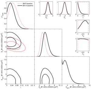 |
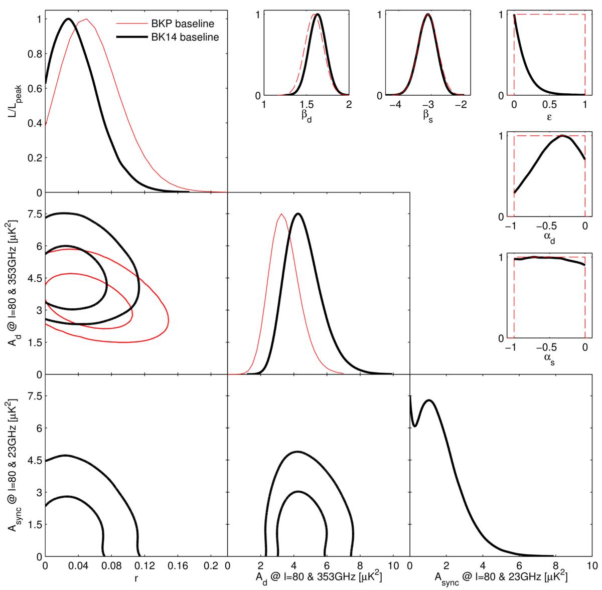
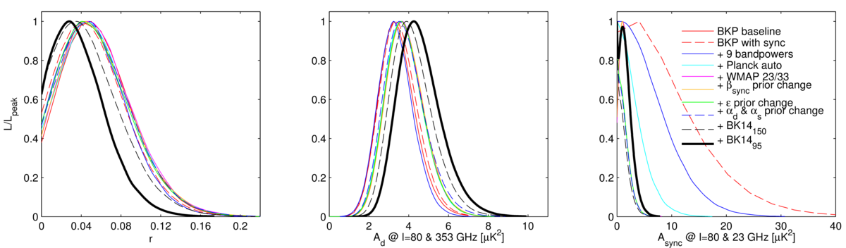
Figure 4: Results of a multicomponent multi-spectral likelihood analysis of BICEP2/Keck+external data. The red faint curves are the primary result from the previous BKP paper (the black curves from Fig. 6 of that paper). The bold black curves are the new baseline BK14 results. Differences between these analyses include adding synchrotron to the model, including additional external frequency bands from WMAP & Planck, and adding Keck Array data taken during the 2014 observing season at 95 & 150 GHz. We see that the peak position of the tensor/scalar ratio curve r shifts down slightly and the upper limit tightens to r0.05 < 0.09 at 95% confidence. The parameters Ad and Async are the amplitudes of the dust and synchrotron B-mode power spectra, where β and α are the respective frequency and spatial spectral indices. The correlation coefficient between the dust and synchrotron patterns is ε. In the β, α and ε panels the dashed red lines show the priors placed on these parameters (either Gaussian or uniform). | PDF / PNG |
| Intermediate likelihood results | 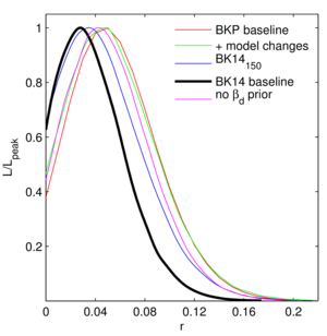 |
Figure 5: Likelihood results on r for several intermediate steps between the BKP (previous) and BK14 (current) analyses. See text of BK-VI for details. | PDF / PNG |
| BB spectral decomposition | 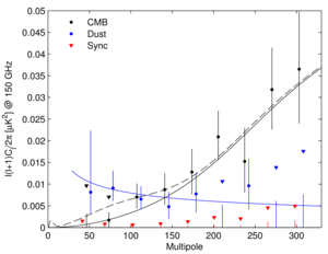 |
Figure 6: Spectral decomposition of the BB data into synchrotron (red), CMB (black) and dust (blue) components. The decomposition is calculated independently in each bandpower, marginalizing over βd, βs, and ε with the same priors as the baseline analysis. Error bars denote 68% credible intervals, with the point marking the most probable value. If the 68% interval includes zero, we also indicate the 95% upper limit with a downward triangle. (For clarity the sets of points are offset horizontally.) The solid black line shows lensed-ΛCDM with the dashed line adding on top an r0.05 = 0.05 tensor contribution. The blue curve shows a dust model consistent with the baseline analysis (Ad,353 = 4.3 μK2, βd = 1.6, αd = −0.4). | PDF / PNG |
| r vs. ns | 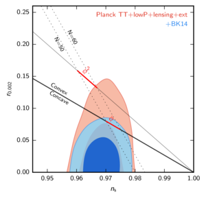 |
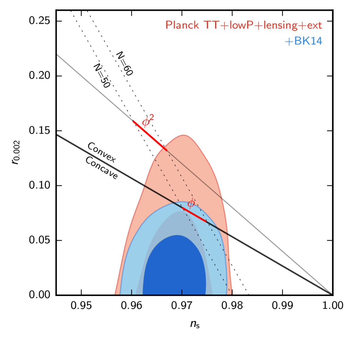
Figure 7: Constraints in the r vs. ns plane when using Planck plus additional data, and when also adding BICEP2/Keck data through the end of the 2014 season including new 95 GHz maps—the constraint on r tightens from r0.05 < 0.12 to r0.05 < 0.07. This figure is adapted from Fig. 21 of Planck 2015 results XIII—see there for further details. | PDF / PNG |
| Noise vs. frequency | 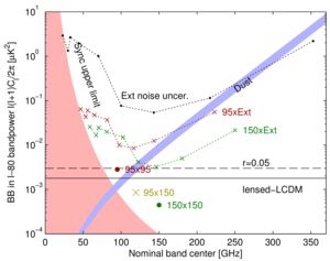 |
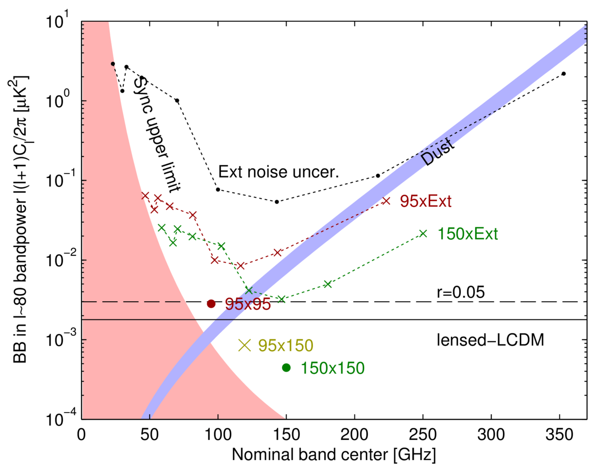
Figure 8: Expectation values and noise uncertainties for the ℓ ∼ 80 BB bandpower in the BICEP2/Keck field. The solid and dashed black lines show the expected signal power of lensed-ΛCDM and r0.05 = 0.05. Since CMB units are used, the levels corresponding to these are flat with frequency. The blue band shows a dust model consistent with the baseline analysis (Ad,353 = 4.3+1.2−1.0 μK2, βd = 1.6) while the pink shaded region shows the allowed region for synchrotron (Async,23 < 3.8 μK2, βs = −3.1). The BICEP2/Keck noise uncertainties are shown as large colored symbols, and the noise uncertainties of the WMAP/Planck single-frequency spectra evaluated in the BICEP2/Keck field are shown in black. The red (green) crosses show the noise uncertainty of the cross-spectra taken between 95 (150) GHz and, from left to right, 23, 30, 33, 44, 70, 100, 143, 217 & 353 GHz, and are plotted at horizontal positions such that they can be compared vertically with the dust and sync curves. | PDF / PNG |
| 150 GHz T, Q, U maps | 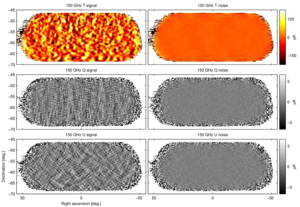 |
Figure 9: T, Q, U maps at 150 GHz using all BICEP2/Keck data up to and including that taken during the 2014 observing season—we refer to these maps as BK14150. The left column shows the basic signal maps with 0.25° pixelization as output by the reduction pipeline. The right column shows a noise realization made by randomly assigning positive and negative signs while coadding the data. These maps are filtered by the instrument beam (FWHM 30 arcmin), timestream processing, and (for Q & U) deprojection of beam systematics. Note that the horizontal/vertical and 45° structures seen in the Q and U signal maps are expected for an E-mode dominated sky. | PDF / PNG |
| 95 GHz T, Q, U maps | 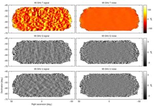 |
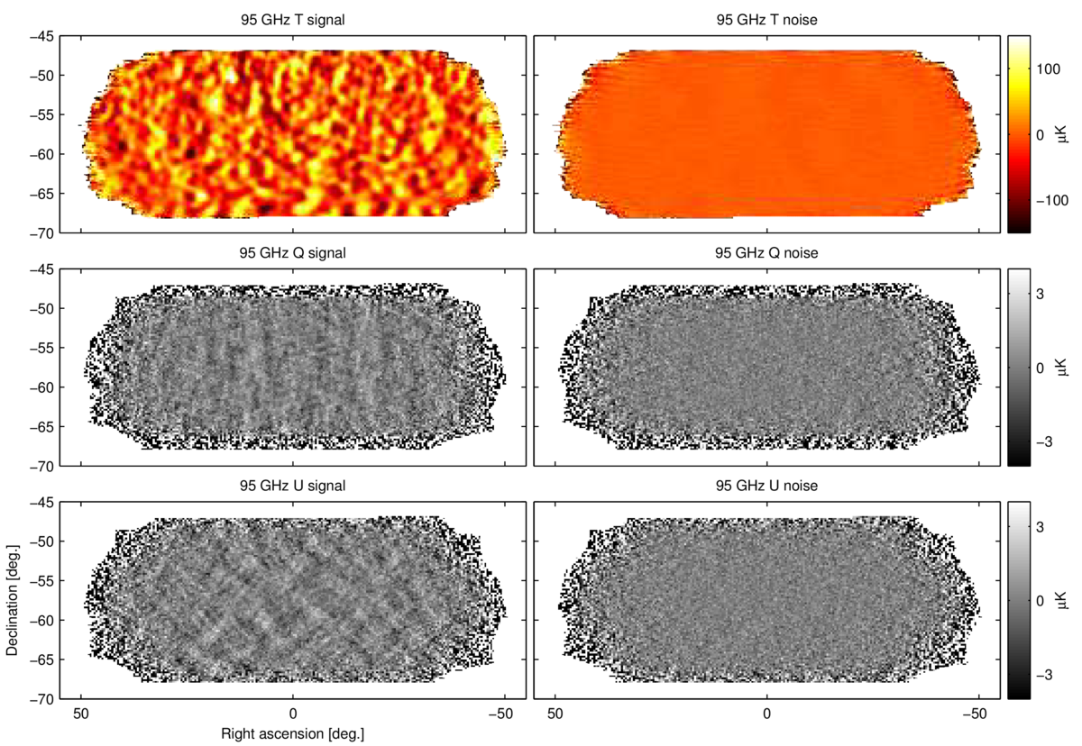
Figure 10: T, Q, U maps at 95 GHz using data taken by two receivers of Keck Array during the 2014 season—we refer to these maps as BK1495. These maps are directly analogous to the 150 GHz maps shown in Fig. 9 except that the instrument beam filtering is in this case 43 arcmin FWHM. | PDF / PNG |
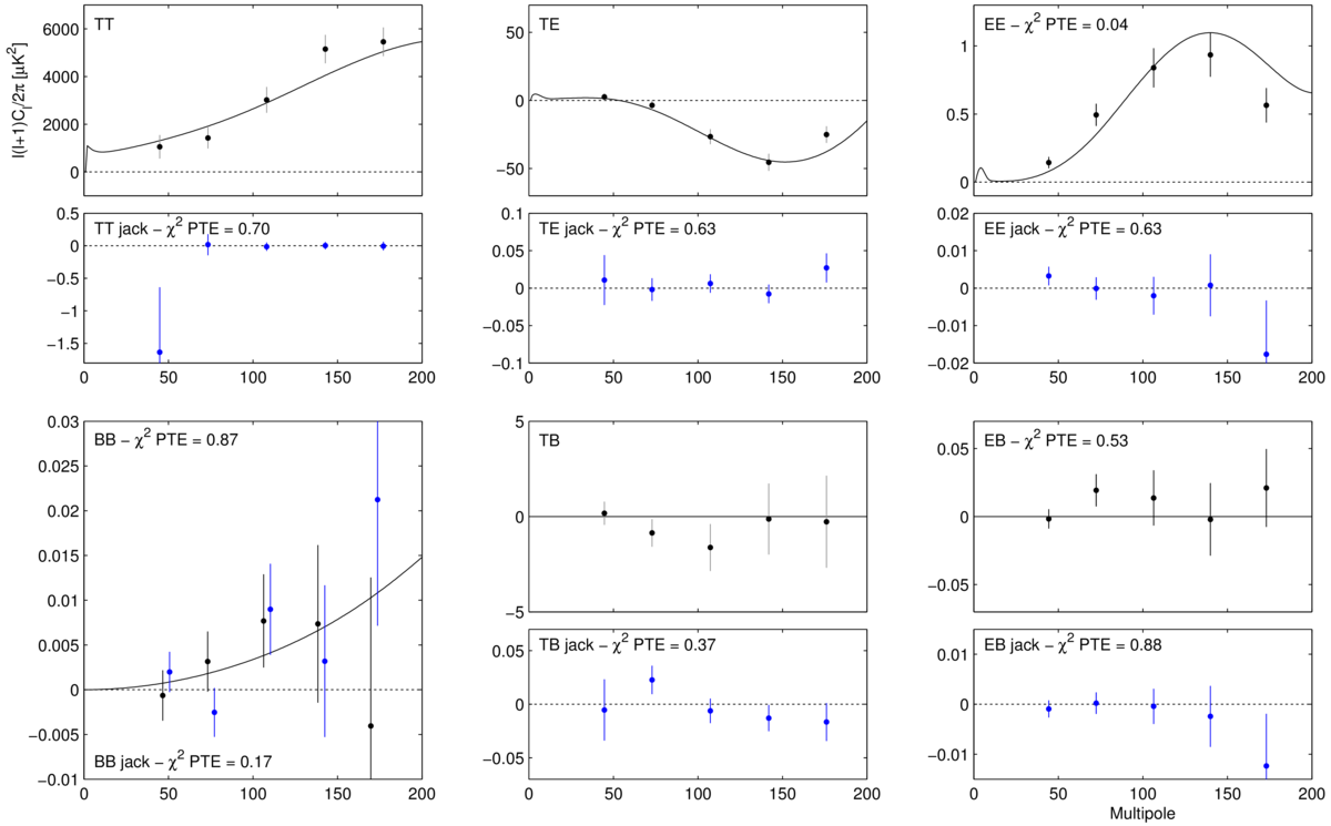
| 95 GHz Keck Array power spectra | 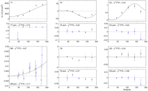 |
Figure 11: Keck Array power spectrum at 95&nbps;GHz for signal (black points) and deck rotation jackknife (blue points). The solid black curves show the lensed-ΛCDM theory spectra. The error bars are the standard deviations of the lensed-ΛCDM+noise simulations and hence contain no sample variance on any additional signal component. The probability to exceed (PTE) the observed value of a simple χ2 statistic is given (as evaluated against the simulations). Note the very different y-axis scales for the jackknife spectra (other than BB). (Also note that the calibration procedure uses EB to set the overall polarization angle so TB and EB as plotted above cannot be used to measure astrophysical polarization rotation.) This figure is analogous to Fig. 2 of BK-I and Fig. 4 of BK-V. | PDF / PNG |
| Jackknife histograms | 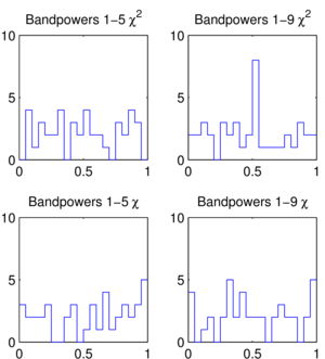 |
Figure 12: Distributions of the jackknife χ2 and χ PTE values for the Keck Array 2014 95 GHz data over the tests and spectra given in Table I of BK-VI. This figure is analogous to Fig. 4 of BK-I and Fig. 6 of BK-V. | PDF / PNG |
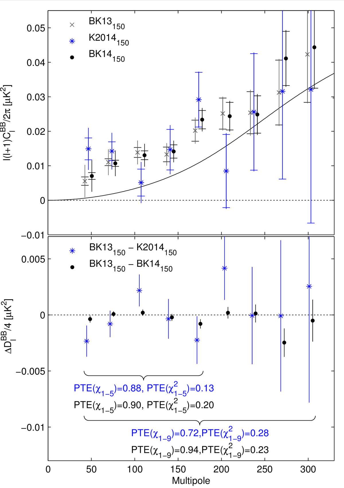
| Comparison of BK13150 and BK14150 BB spectra | 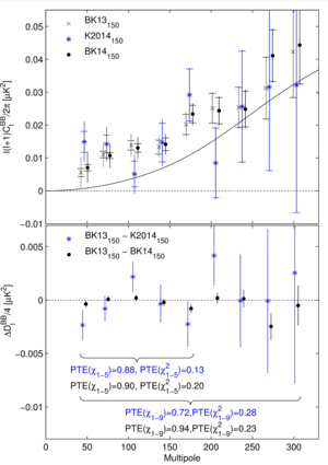 |
Figure 13: Upper: Comparison of the 150 GHz BB autospectrum as previously published (BK13150), for 2014 along (K2014150) and for the addition of the two (BK14150). The inner error bars are the standard deviation of the lensed-ΛCDM+noise simulations, while the outer error bars include the additional fluctuation induced by a signal contribution matching the excess above lensing seen in the data. Note that neither of these uncertainties are appropriate for comparison of the band power values—for this see the lower panel. (For clarity both sets of points are offset horizontally.) Lower: The difference of the pairs of spectra shown in the upper panel divided by a factor of four. The error bars are the standard deviation of the pairwise differences of signal+noise simulations which share common input skies (the simulations used to derive the outer error bars in the upper panel). Comparison of these points with null is an appropriate test of the compatibility of the spectra and the PTE of χ and χ2 are shown. This figure is similar to Fig. 8 of BK-V. |
PDF / PNG |
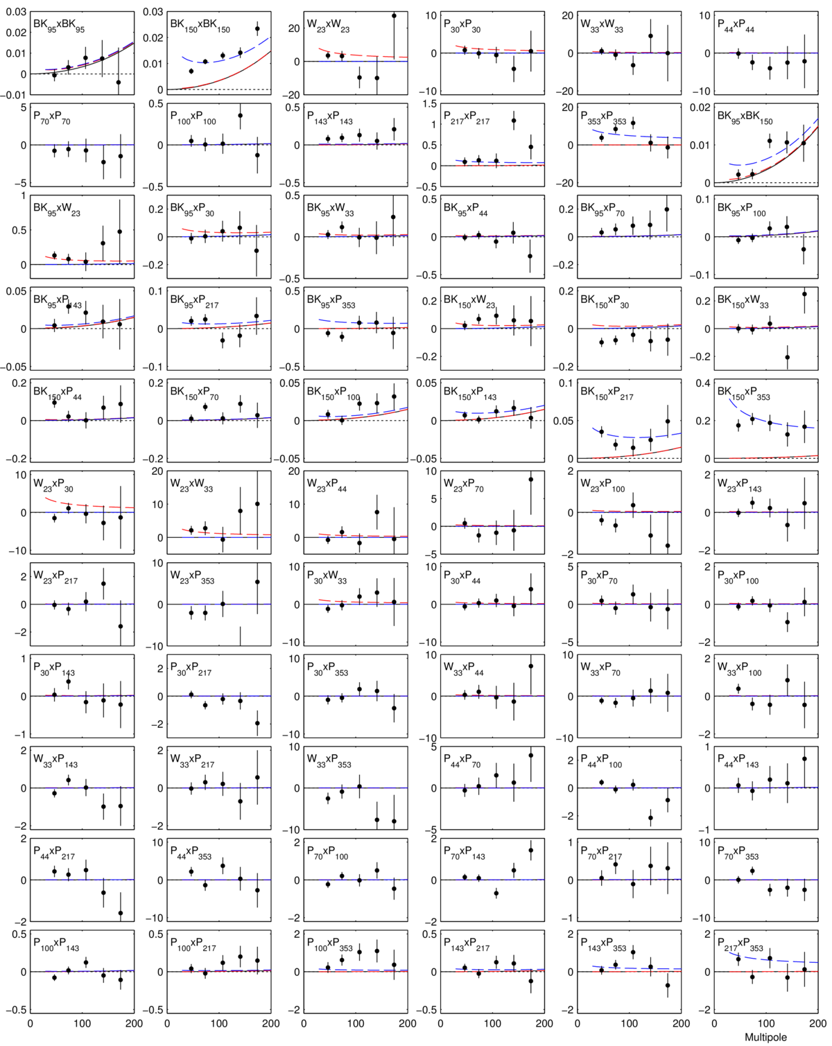
| All BB auto- and cross-spectra |  |
Figure 14: BB auto- and cross-spectra between the BK14 95 & 150 GHz maps and bands of WMAP and Planck. In all cases the quantity plotted is ℓ(ℓ+1)Cℓ/2π (μK2), and the black curves show the lensed-ΛCDM theory spectrum. The error bars are the standard deviations of the lensed-ΛCDM+noise simulations and hence contain no sample variance on any additional signal component. The blue dashed lines show a baseline lensed-ΛCDM+dust model (Ad,353 = 4.3 μK2, βd = 1.6, αd = −0.4). The red dashed lines show an upper limit lensed-ΛCDM+synchrotron model (Async,23 = 3.8 μK2, βs = −3.1, αs = −0.6). | PDF / PNG |
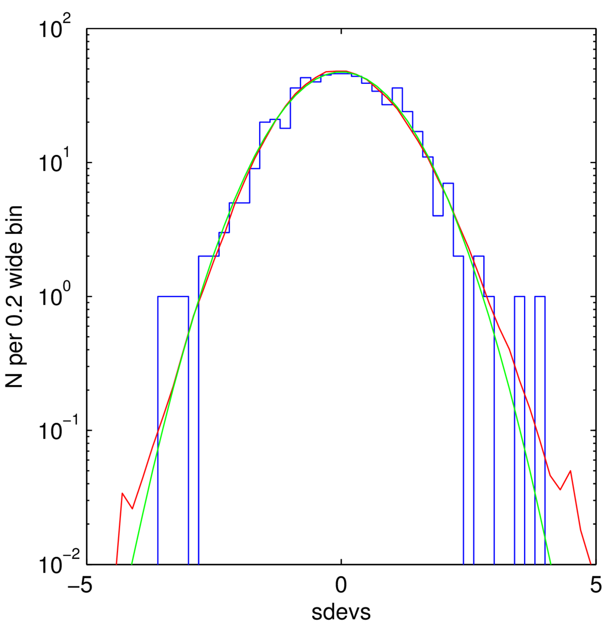
| Bandpower deviations | 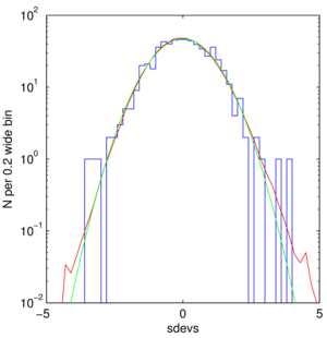 |
Figure 15: The normalized deviations of the bandpowers shown in Fig. 14 from the maximum likelihood model is shown as the blue histogram. The red curve is the same thing accumulated over 499 sims of a lensed-ΛCDM+dust model, and the green curve shows a Gaussian with unit width. | PDF / PNG |
| Likelihood evolution | 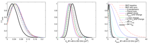 |
Figure 16: Evolution of the BKP analysis to the “baseline” analysis as defined in this paper—see Appendix E1 for details. | PDF / PNG |
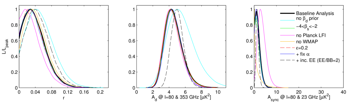
| Likelihood variations | 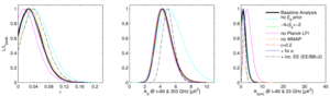 |
Figure 17: Likelihood results when varying the data sets and the model priors—see Appendix E2 for details. | PDF / PNG |
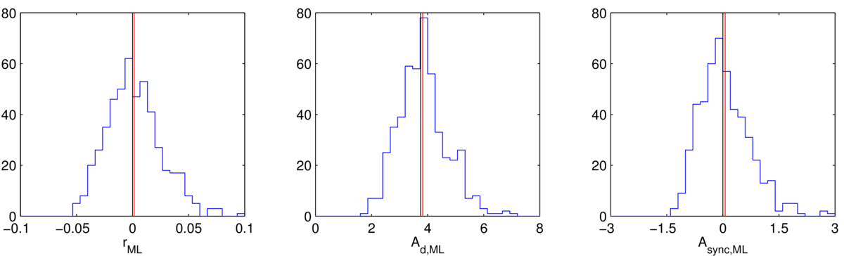
| Likelihood validation | 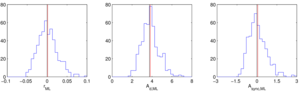 |
Figure 18: Results of validation tests running the likelihood on simulations of a lensed-ΛCDM+dust model (Ad,353 = 3.75 μK2, βd = 1.59 and αd = −0.42). The blue histograms are the recovered ML values with the red line marking their means. The black line shows the input value. In the left panel σ(r) = 0.024. See Appendix E3 for details. | PDF / PNG |
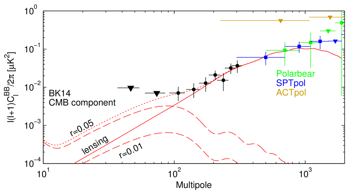
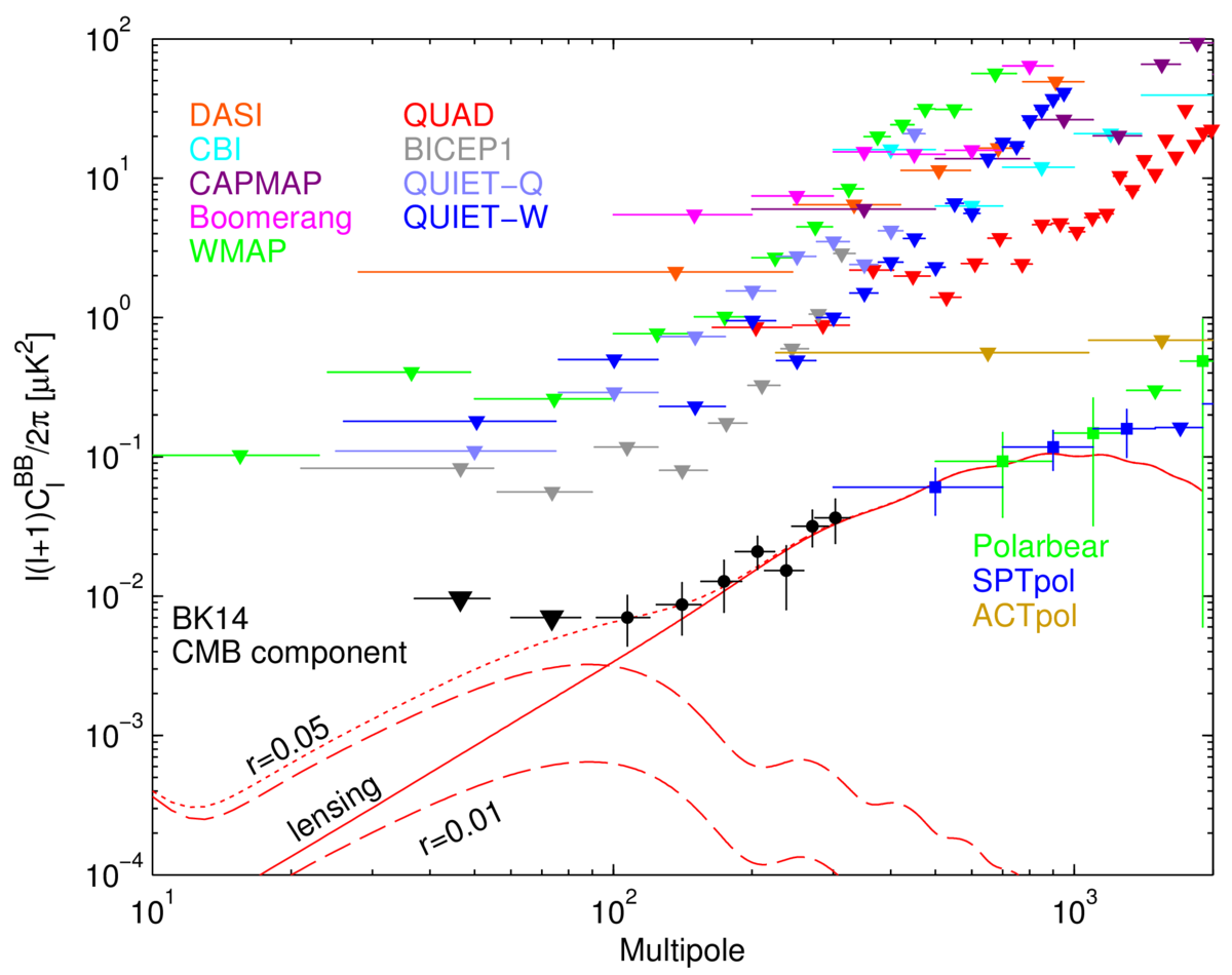
| BB results compilation | 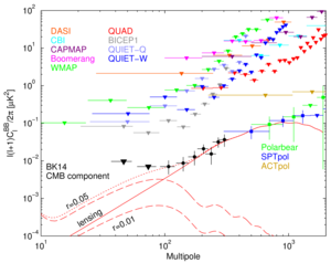 |
BK14 CMB component bandpowers from Figure 6 of BK-VI shown along with results from many other experiments. For points that are less than 1σ from zero, the 95% upper limit is shown instead as a downward triangle. Theory curves shown are lensed-ΛCDM (solid red), tensor contributions for r=0.05 and r=0.01 (dashed red, labeled), and lensed-ΛCDM+r=0.05 (dotted). For other experiments, refer to Leitch et al 2005 (DASI), Sievers et al 2007 (CBI), Bischoff et al 2008 (CAPMAP), Montroy et al 2006 (BOOMERANG), Bennett et al 2013 (WMAP), Brown et al 2009 (QUaD), Barkats et al 2014 (BICEP1), QUIET Collaboration 2011 (QUIET-Q), QUIET Collaboration 2012 (QUIET-W), POLARBEAR Collaboration 2014 (POLARBEAR), Keisler et al 2015 (SPTpol), and Næss et al 2014 (ACTpol). Note that this figure does not appear in BK-VI. Alternate figure version including only “Stage 2” CMB polarization experiments: PDF, PNG |
PDF / PNG |
History
- 2016-09-22: Minor updates to figures and captions in order to match Phys. Rev. Lett. published version.
- 2015-10-30: Posted BK-VI: Improved Constraints On Cosmology and Foregrounds When Adding 95 GHz Data From Keck Array figures.